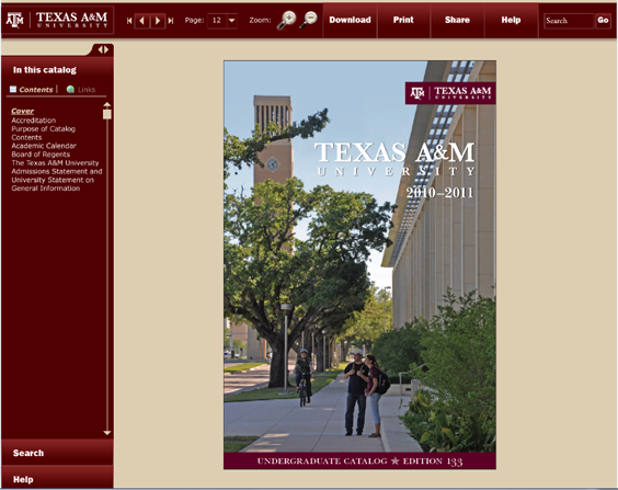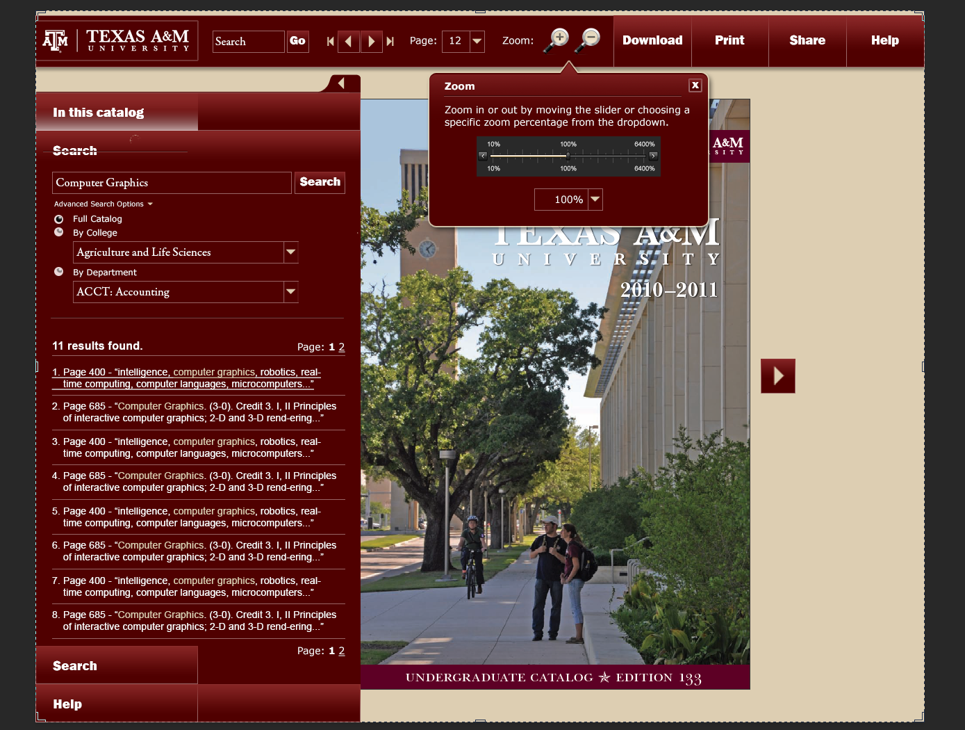
These were my original designs for a Catalog Presentation site. The idea behind it was that you could search for all the places a certain part of text would show up all throughout the catalog, and you could display the page just as if it were a book on your desktop. You could also turn pages, go straight to a particular page, zoom in and out of the page so you can view it better, etc. You could also download sections of the book instead of downloading it in its entirety. (These catalogs are massive, and having the whole PDF may not be necessary or wanted.)
The search (and zoom) functionality is shown here:

This would have been a huge endeavor for my department, but it wasn’t in the cards, and it would have been inaccessible to the blind.

Your style is really unique compared to other people I have read stuff from.
Many thanks for posting when you’ve got the opportunity, Guess I will just book mark this site.
Thank you for the compliment! (I take being unique as a good thing.)
That was a fun design to make; just wish I would have gotten the experience of developing it. 🙂
Take care,
Sandra