Get your engineering master’s degree online with Texas A&M’s Engineering Online.

Get your engineering master’s degree online with Texas A&M’s Engineering Online.

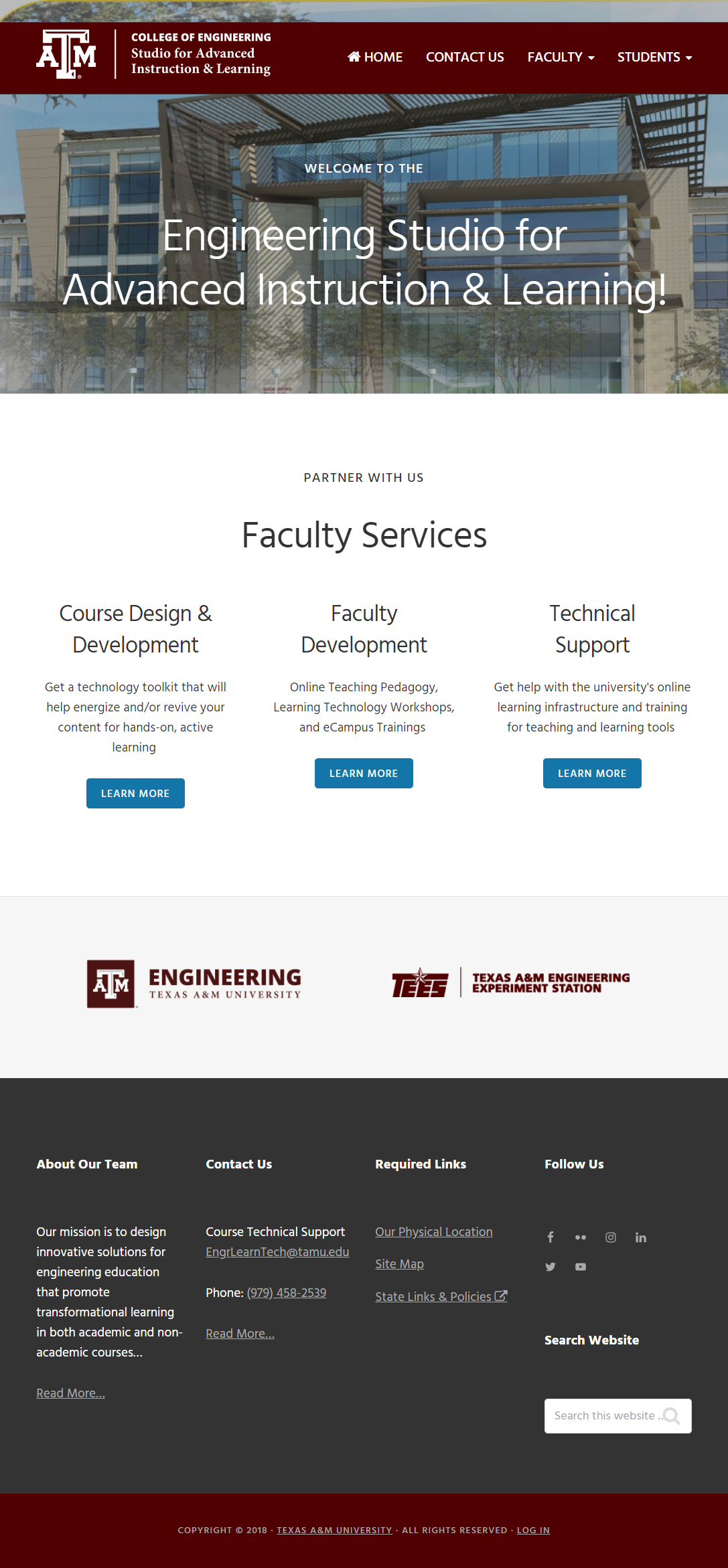
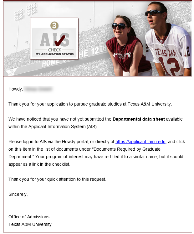
I got to quickly design an HTML Email to go out to applicants within the Applicant Information System (AIS). I chose two photos from the front page of the website for the letterhead because they would scream “Something is missing in my application! I must take action!”
The work for an HTML Email is known by those who have done them as TEDIOUS, but I figured it out with some fun tweaks here and there. I had to remember how things were done several years ago since the email browser capabilities are not up-to-speed with a regular browser like Firefox or Chrome. I had to deal with no style sheets…to my chagrin. (Those are my favorite!) In my case, I also had to figure out that “\r\n” characters (line breaks) were in the html document when read in by the code, so they needed to be stripped out (replaced with empty strings). This HTML-email-building was an experience that will make my life easier when I have to do it again in the future!
In the end, the customer said they looked “fabulous” and “incredibly professional”. I’m blushing! Kudos to the original site designer, Ms. Humphreys, for making this email design job so easy!
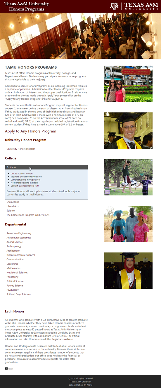
I worked with the TAMU Honors Programs office directors to figure out a solution for them. They wanted to list out a link to each program: whether there was a separate application for a program, if current students could apply, if there was Honors housing, etc. I designed and implemented this design to help them show the data only if the desired honors program was clicked. Then, it would expand and show details of the program.
I created a web part within Kentico CMS that would allow the user to fill out a simple form to display what shows in the blue box. This was done for each honors program and is easily editable by the Honors Programs office, without requiring assistance from the IT department.
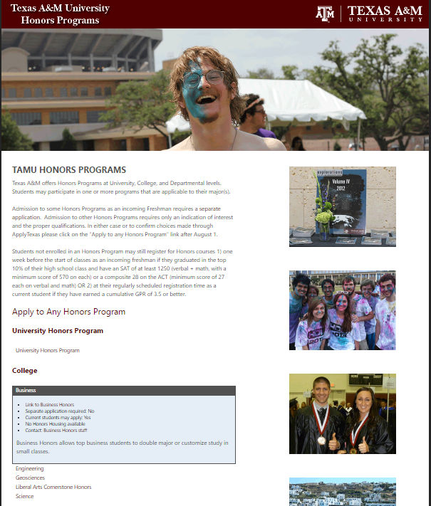
I created the images based on several RAW photos that were handed to me. The headers and side images show at random each time the page is visited.
Another version of the site, since the headers rotate:
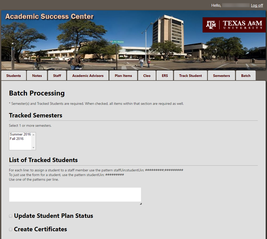
The Academic Success Center (ASC) provides several ways to help students stay in and thrive at Texas A&M University. The above image is an example “batch processing” page in their Game Plan website, where you can select several students at a time to, for instance, put them all in a tutoring session, or give them all certificates for going to a special workshop.
I designed and implemented the Game Plan website (and this page) for the Academic Success Center using MVC, C#, HTML, Bootstrap, jQuery, JavaScript, and CSS. This site was created before the surge of responsive sites, so only portions of the site are actually responsive.
The original design for the header appeared as this (the ring is in the center as requested), but the office moved locations and the header was changed to what shows above.

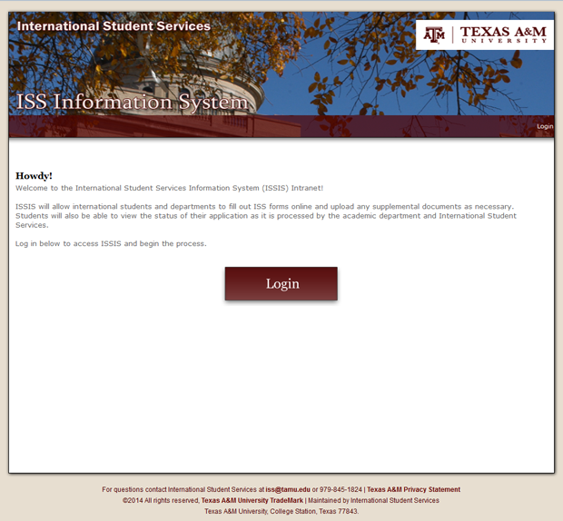
I designed and implemented the ISS Information System website (webpage renamed later). This was again done in SharePoint to be a portal and workflow for the International Student Services department. The CSS styles were changed to match the given design instead of the typical SharePoint layout.
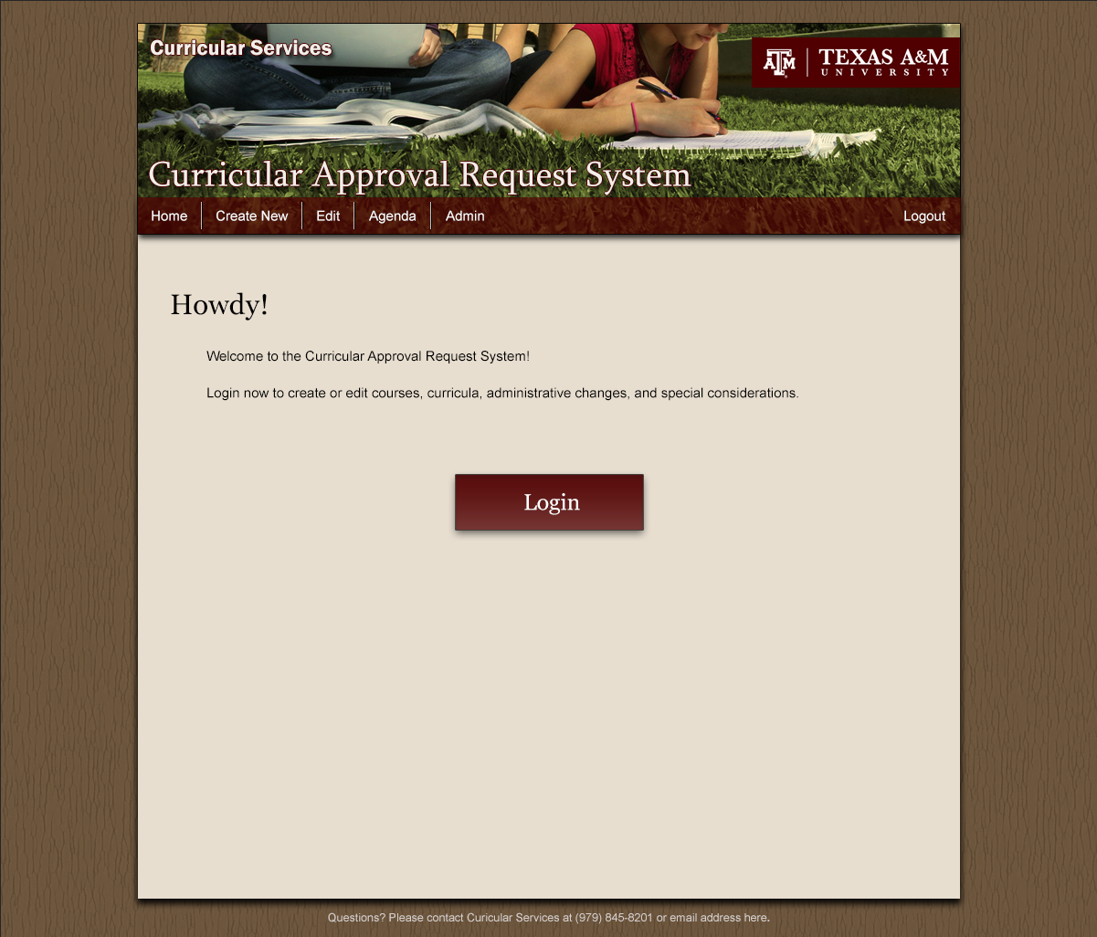
I designed and implemented the CARS website in 2011 within SharePoint for Curricular Services.
I must say, getting the menu to consistently display over the header image, and to make each drop-down menu image highlight upon hover, at the time, was very challenging. I thought the end result looked fabulous, and the work was totally worth it!
The image for the header originally had a bright pink backpack that really detracted away from the two females studying. The color of the original image was altered as well so that the green matched our branding guidelines, and therefore, matched the tan background.
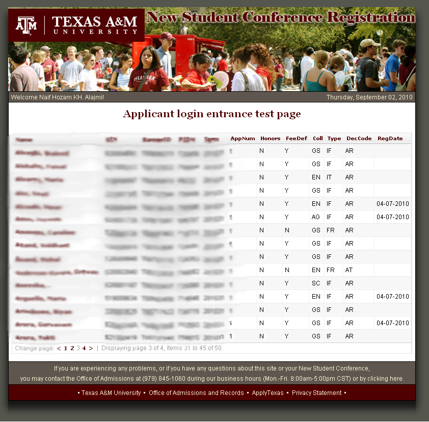
The New Student Conference (NSC) Registration site was one of the first websites I designed on my own for Texas A&M University Admissions. It is blurred out for security reasons, but this was a typical page in the site.
The image was modified to match with the coloring, and the rest of the colors aligned with the University Brand Guide.
The site has since been redesigned and is now within a CMS.
The Office of the Registrar gives you the opportunity to purchase duplicate diplomas once you graduate from Texas A&M University. You simply go to a form page to order a duplicate of your diploma for any different reason. In the beginning, this form page just needed a banner, and I was asked to create it. This is what I created for the site:
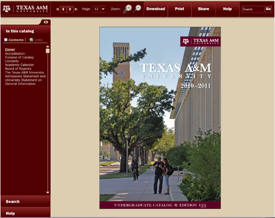
These were my original designs for a Catalog Presentation site. The idea behind it was that you could search for all the places a certain part of text would show up all throughout the catalog, and you could display the page just as if it were a book on your desktop. You could also turn pages, go straight to a particular page, zoom in and out of the page so you can view it better, etc. You could also download sections of the book instead of downloading it in its entirety. (These catalogs are massive, and having the whole PDF may not be necessary or wanted.)
The search (and zoom) functionality is shown here:
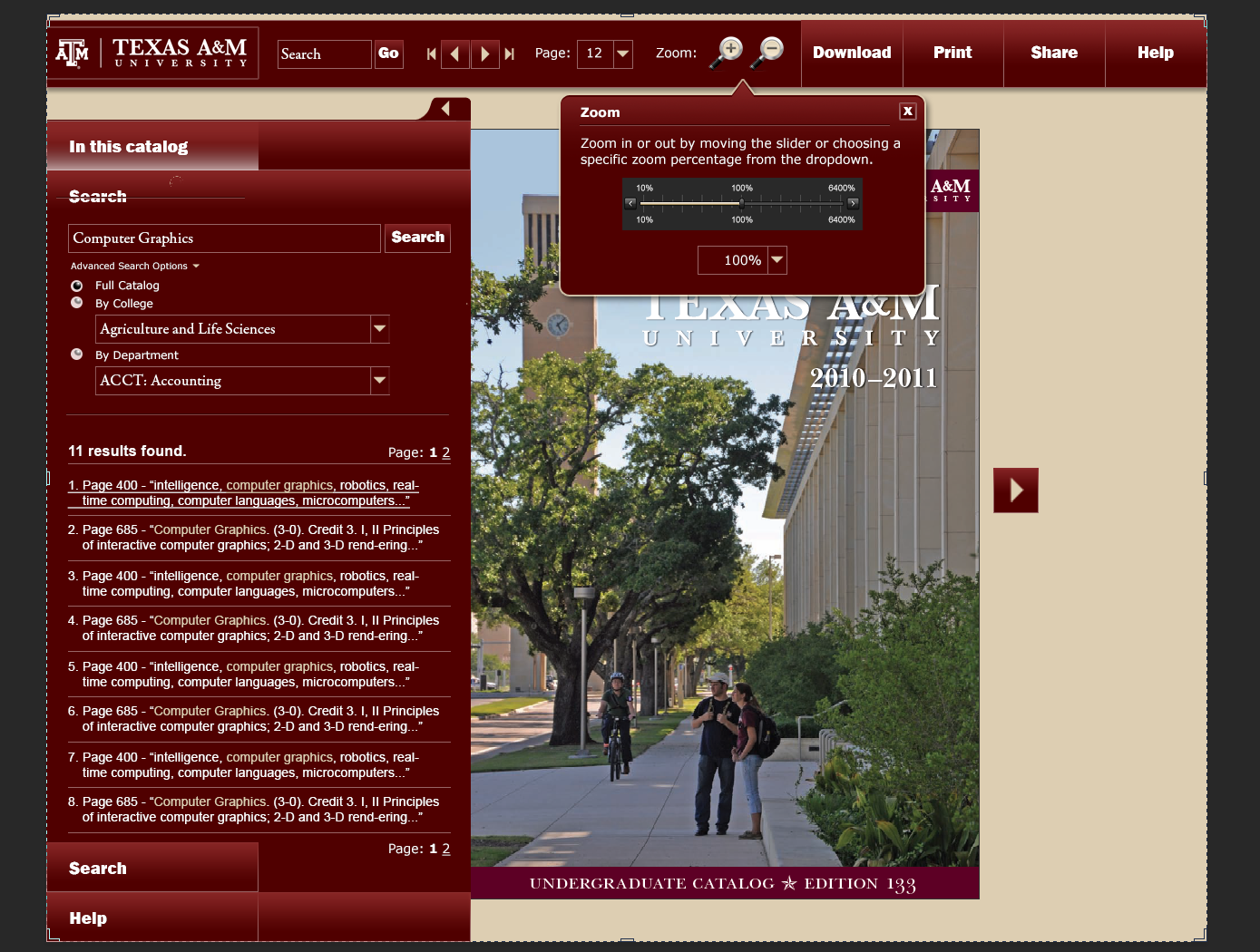
This would have been a huge endeavor for my department, but it wasn’t in the cards, and it would have been inaccessible to the blind.