AGGIEBOUND

AGGIEBOUND Landing Page (2014):
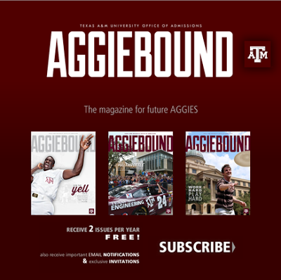
AGGIEBOUND Temporary Landing Page
AGGIEBOUND – Temporary Landing Page

I implemented this landing page using Kentico CMS, an ASP.Net back-end content management system. Since another member of the team could not get the job done on time, I stepped in (as requested by the frazzled client) and had the page created within the hour. The next day, Aggieland Saturday, thousands of prospective students would be told to visit the website to subscribe to the AGGIEBOUND Magazine.

This was a landing page to stay up until the full design was fleshed out and could be implemented for the AGGIEBOUND website.

AGGIEBOUND (2015):

AGGIEBOUND
AGGIEBOUND – Fully Scrolled

After the full AGGIEBOUND design was complete, I also implemented it within Kentico CMS.  This has been one of my favorite websites to work on because of the new features put in, like the Twitter feed.

Office of Admissions Redesign

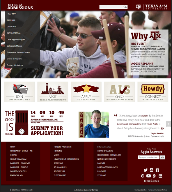
Office of Admissions
Office of Admissions Website Redesign (2015)

I have worked on the Office of Admissions websites since I came to the team in 2008.  A redesign of their website was done in 2009, which I implemented from scratch using just HTML and CSS.  The department did not use any type of Content Management System back then.

The version above is the latest total overhaul of the design, done in 2015.  Given the design again by Admissions Communications, I added this website into Kentico CMS.  I set up each area so they could ultimately make the content changes instead of having to depend on their IT department for each change.

This was a great exercise in CSS tweaking and Responsive Design. Also, I had to open up enough of the front page so that the original designer could change it, but not enough so she could mess up the structure of the page.  A nice balance was reached between the two of us discussing what would be best for everyone.

Honors Programs

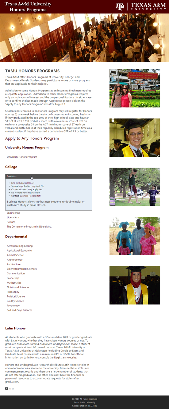
TAMU Honors Programs Website, Fully Scrolled Version
Full TAMU Honors Programs Website

I worked with the TAMU Honors Programs office directors to figure out a solution for them.  They wanted to list out a link to each program: whether there was a separate application for a program, if current students could apply, if there was Honors housing, etc.  I designed and implemented this design to help them show the data only if the desired honors program was clicked.  Then, it would expand and show details of the program.

I created a web part within Kentico CMS that would allow the user to fill out a simple form to display what shows in the blue box. This was done for each honors program and is easily editable by the Honors Programs office, without requiring assistance from the IT department.

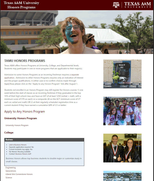
I created the images based on several RAW photos that were handed to me.  The headers and side images show at random each time the page is visited.

Another version of the site, since the headers rotate:

Honors Programs Website - Different Header Banner showing guy smiling with paint all over the right side of his face
Honors Programs Website with alternate banner, showing expanded Business Honors Program