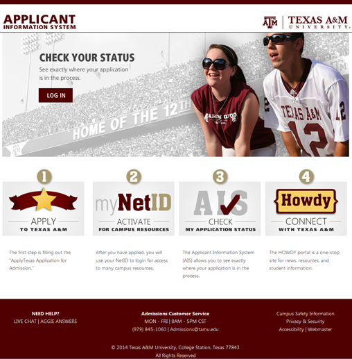
Applicant Information System

Applicant Information System

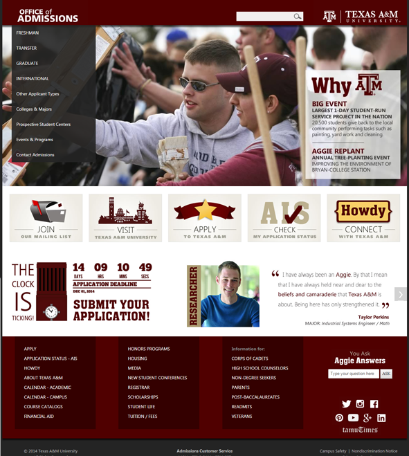
This is my implementation of a design created by Admissions Communications for our Applicant Information System.  I used HTML, Bootstrap and CSS for the home page.  Everything internal is based on the styles used on the front page, but for what makes sense using Bootstrap. I mocked up most of the internal pages using a tool called Balsamiq to “draw out” what each page could look like in its final stages.

This site is developed now in many different languages: HTML, Bootstrap, CSS, jQuery, JavaScript, MVC, and C#, using the Entity Framework.

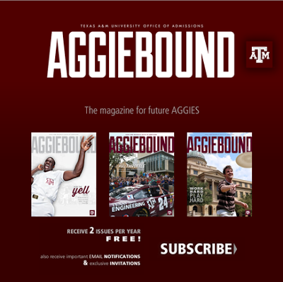
AGGIEBOUND

AGGIEBOUND Landing Page (2014):

AGGIEBOUND Temporary Landing Page
AGGIEBOUND – Temporary Landing Page

I implemented this landing page using Kentico CMS, an ASP.Net back-end content management system. Since another member of the team could not get the job done on time, I stepped in (as requested by the frazzled client) and had the page created within the hour. The next day, Aggieland Saturday, thousands of prospective students would be told to visit the website to subscribe to the AGGIEBOUND Magazine.

This was a landing page to stay up until the full design was fleshed out and could be implemented for the AGGIEBOUND website.

AGGIEBOUND (2015):

AGGIEBOUND
AGGIEBOUND – Fully Scrolled

After the full AGGIEBOUND design was complete, I also implemented it within Kentico CMS.  This has been one of my favorite websites to work on because of the new features put in, like the Twitter feed.

Office of Admissions Redesign

Office of Admissions
Office of Admissions Website Redesign (2015)

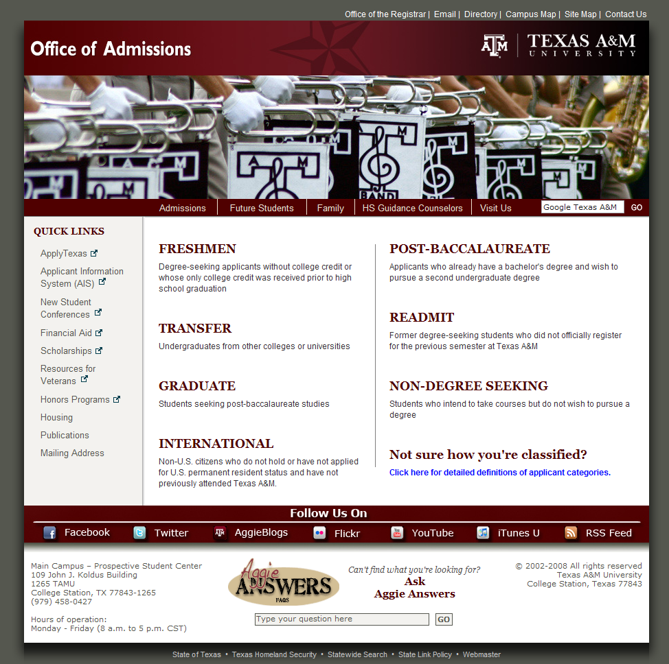
I have worked on the Office of Admissions websites since I came to the team in 2008.  A redesign of their website was done in 2009, which I implemented from scratch using just HTML and CSS.  The department did not use any type of Content Management System back then.

The version above is the latest total overhaul of the design, done in 2015.  Given the design again by Admissions Communications, I added this website into Kentico CMS.  I set up each area so they could ultimately make the content changes instead of having to depend on their IT department for each change.

This was a great exercise in CSS tweaking and Responsive Design. Also, I had to open up enough of the front page so that the original designer could change it, but not enough so she could mess up the structure of the page.  A nice balance was reached between the two of us discussing what would be best for everyone.

Catalog Presentation

Catalog Presentation

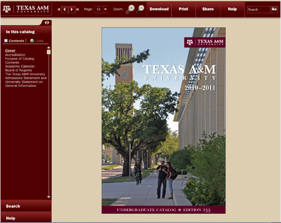
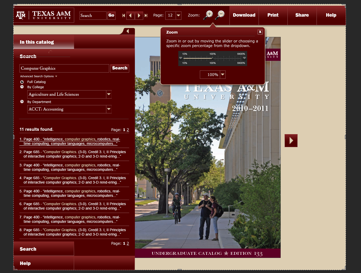
These were my original designs for a Catalog Presentation site. The idea behind it was that you could search for all the places a certain part of text would show up all throughout the catalog, and you could display the page just as if it were a book on your desktop. You could also turn pages, go straight to a particular page, zoom in and out of the page so you can view it better, etc. You could also download sections of the book instead of downloading it in its entirety. (These catalogs are massive, and having the whole PDF may not be necessary or wanted.)

The search (and zoom) functionality is shown here:

Catalog Presentation Search

This would have been a huge endeavor for my department, but it wasn’t in the cards, and it would have been inaccessible to the blind.

Office of Admissions (2009)

Admissions Website

This is the old version of the Admissions website.  I built this design (given to us by Admissions Communications) with strictly HTML and CSS.  I was responsible for updating all of the content for the communications department and it was, well, tedious! Each time there was an update needed, I was the one to ask!

Eventually, it was redesigned, and I put it into the Kentico CMS so that the communications department could work on updating their own content. (Ahhh…)